
Tuesday, December 3, 2013

Tuesday, November 19, 2013
Weekly Blog #9
Super Typhoon Haiyan, one of strongest storms ever, hits central Philippines.
Source: http://www.cnn.com/2013/11/07/world/asia/philippines-typhoon-haiyan/


Thursday, November 7, 2013

Wednesday, November 6, 2013
Dot Density example

Source: https://www.google.com/search?q=dot+density+map&tbm=isch&tbo=u&source=univ&sa=X&ei=rY96UuDGD6zjsATD94GYDA&sqi=2&ved=0CDgQsAQ&biw=1920&bih=974#facrc=_&imgdii=_&imgrc=332nS_uEFHKWwM%3A%3BPTuZD8f7T7ItfM%3Bhttp%253A%252F%252Fedac.unm.edu%252Fwordpress%252Fwp-content%252Fuploads%252F2008%252F06%252Felderly_aian_big.jpg%3Bhttp%253A%252F%252Fedac.unm.edu%252F2008%252F07%252Fnicoa-interactive-atlas-of-indian-elder-health%252F%3B800%3B560
Final Project
For my final project I was thinking of working off the map I just created for GIS Day at GMU. It's a color map addressing site suitability for a new homeless shelter in Seattle, WA. I chose this topic because I saw an alarming rate of unsheltered homeless people in that area. Right now the map would be raster data, where I assigned a value to each cell according to it's suitability. I got a lot of my data from a Seattle GIS site provided by the local government. Also, the Census bureau. I feel like my biggest challenge will be my use of color because that seems to me to be my biggest struggle. Also, not trying to display too much information on one map. Hopefully I can over come that by using the color sites provided in class and making sure I focus on just my point of interest.
This is an example of what I would like to achieve. (Largest map)

This is an example of what I would like to achieve. (Largest map)

Thursday, October 31, 2013

Tuesday, October 29, 2013

Isoline Map example

I like how this map displays alot of classes and the map is suprisingly easy to read. Visually I feel like the colors work together and I can still understand the data.
Monday, October 21, 2013

Thursday, October 17, 2013
Lab 6
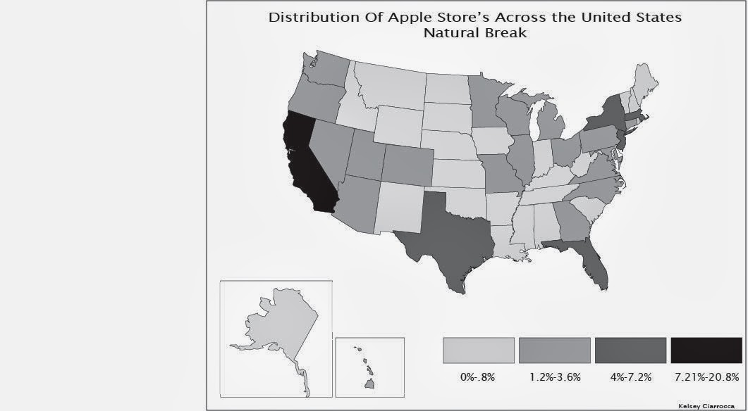
 When I look at the map I printed and compare the colors to the version online, I do notice a slight difference in color. The online version shows more vivid and deep colors. The printed version seems a little washed out in color. The colors are more dull, it especially shows in my 0% color and background.
 Monday, October 7, 2013

Thursday, September 26, 2013

Saturday, September 21, 2013
The Use Of Font
I found a map that to me, was extremely creative and it caught my eye. It uses text to create a global map. Although everything is made from text, the font is neat and legible. I like how to emphasis some countries, they did bolder and bigger letters so that they would stand out.

Tuesday, September 10, 2013

Thursday, September 5, 2013
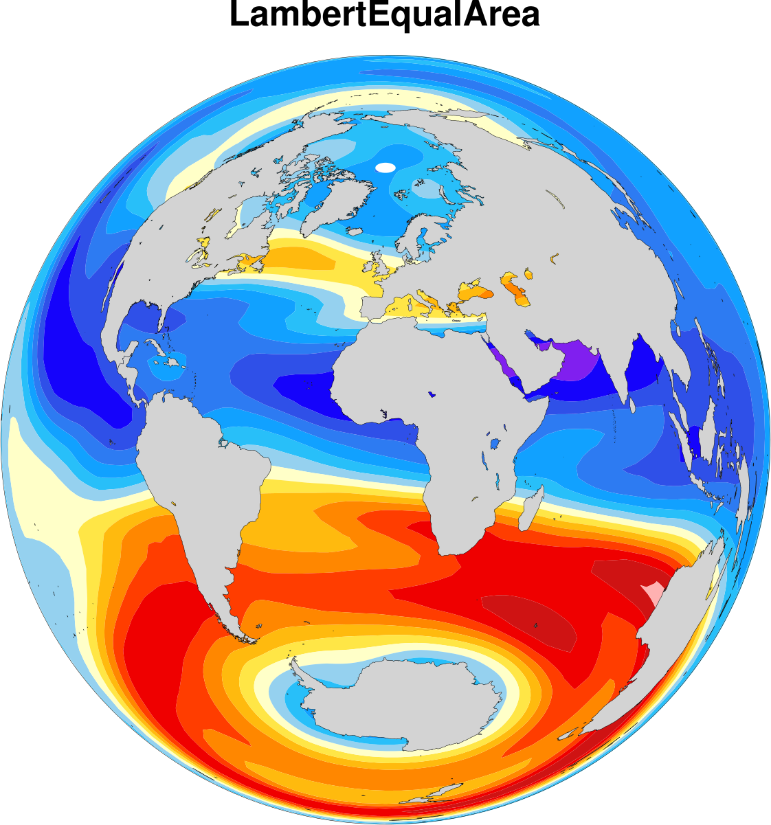
Map Projection

Link: http://www.ncl.ucar.edu/Document/Graphics/Images/ncl_map_projections.lambertequalarea.png
Tuesday, September 3, 2013

Thursday, August 29, 2013
Annual Average Max Temperatures

Link: http://commons.wikimedia.org/wiki/File:Average_Annual_High_Temperature_of_the_United_States.jpg
Interactive Map: Ulta Beauty Store Locations in the United States.

Link: http://find.mapmuse.com/map/ulta
Subscribe to:
Comments (Atom)