This is an example of what I would like to achieve. (Largest map)


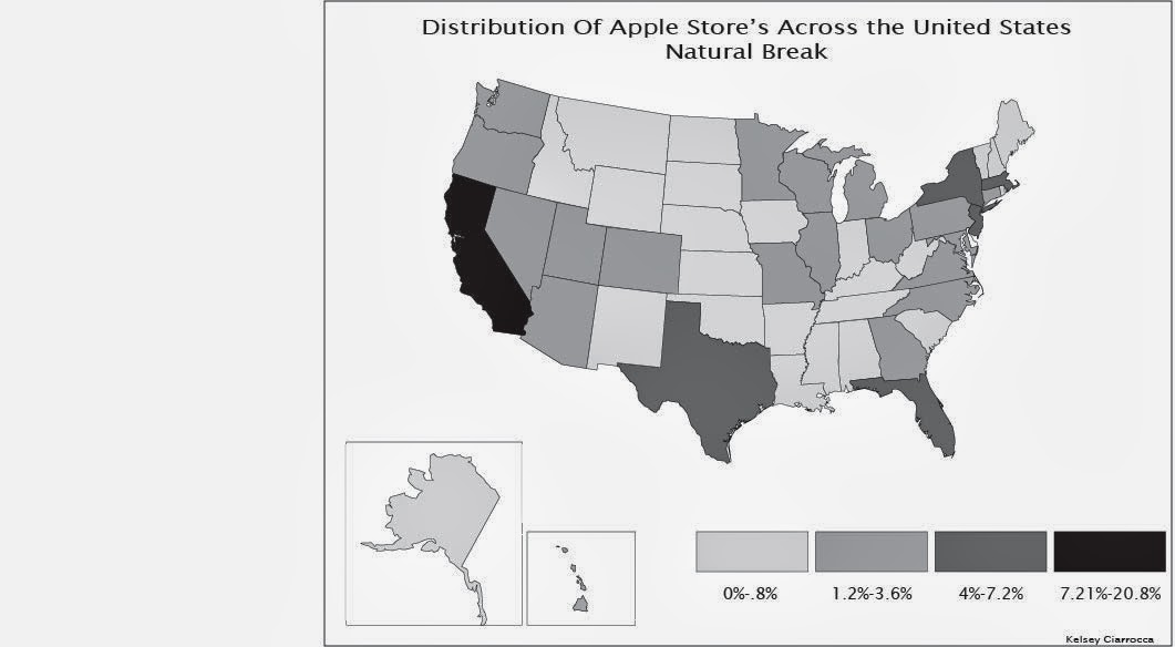
 When I look at the map I printed and compare the colors to the version online, I do notice a slight difference in color. The online version shows more vivid and deep colors. The printed version seems a little washed out in color. The colors are more dull, it especially shows in my 0% color and background.